
Reimaginging Scholarships in Asia with Finder
Finder is a scholarship finding app to help students easily identify universities with relevant scholarships for them.
Role
Team leader and UIUX Designer
Scope
Sole designer of the UIs shown in this case study.
Duration
2 weeks
We were challenged to use Design Thinking to solve a problem affecting CU students
As we interviewed CUHK students on their experience seeking out financial aid, this is what we found:
“While we get a lot of scholarship emails from CUHK, it can be really hard to identify which scholarships I would be a good fit for.”

CUHK student #1
“We get a lot of emails from CUHK everyday, and being able to keep an eye out for scholarship emails and sort through irrelevant scholarships, while needing financial support is overwhelming.”

CUHK student #2
The problem
Finding scholarships that are relevant to you can be difficult

Discovery
Difficulty in identifying available opportunities.
Overwhelming number of scholarship sources to track (both in terms of sites and emails.
Very little filtering information provided, resulting in unnecessary back and forth.
Qualify
User must review each opportunities respective page to identify relevancy, with no way to preliminarily filter.
Occasionally a multi-step process, requiring the user to navigate from the announcement page to the full scholarship page with qualifying information.
Act
Different scholarships may have varying submission methods.
Lack of visibility of application progress due to volume of emails.
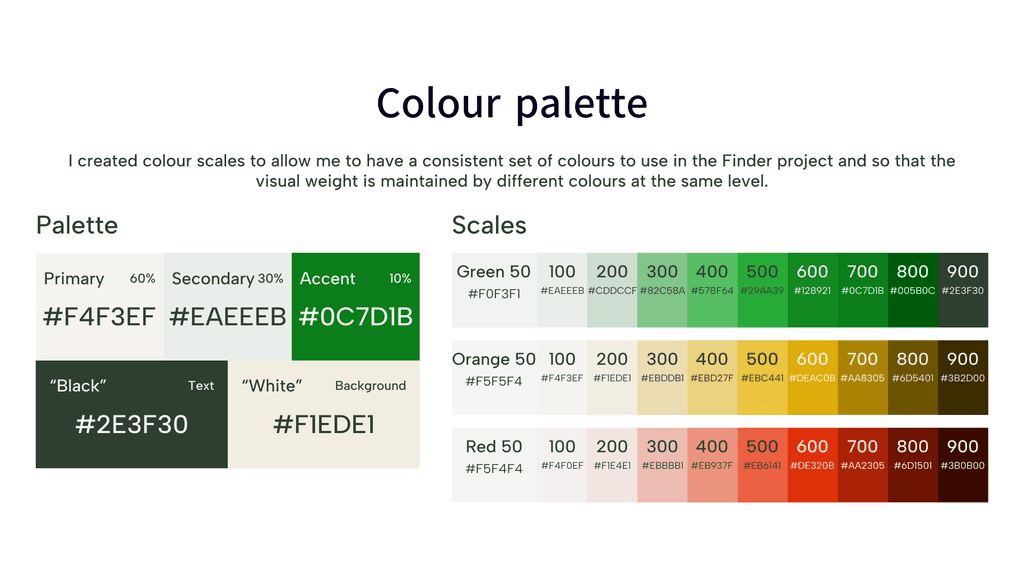
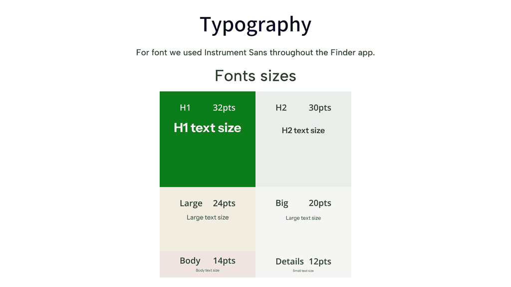
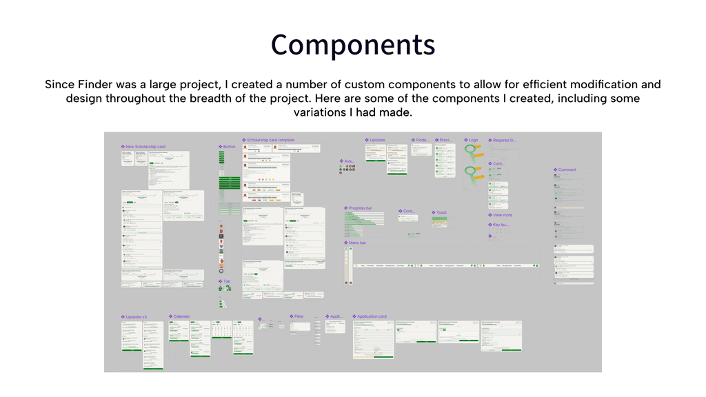
Components and asset library
Final Designs

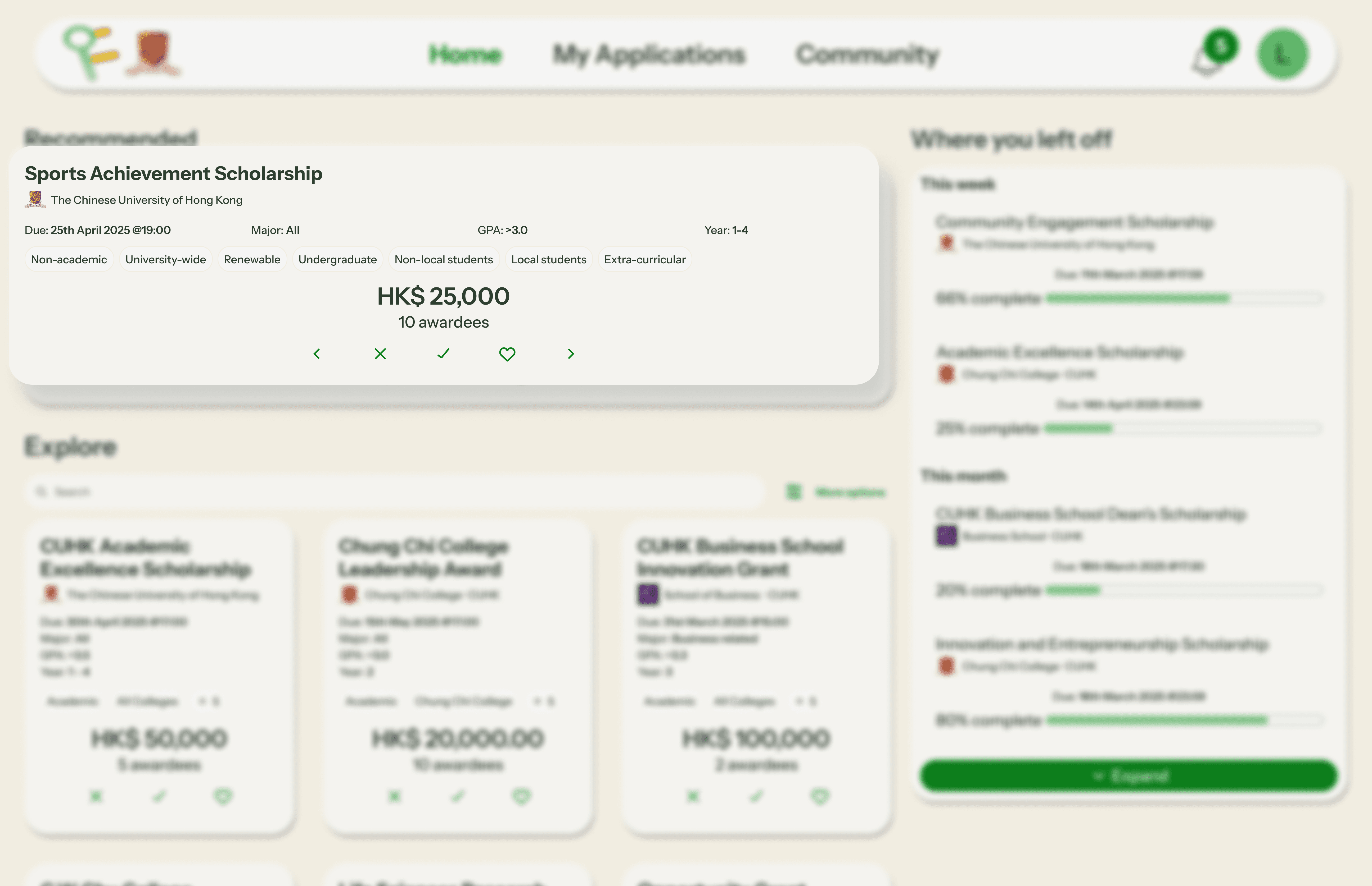
Navigating scholarships
To enable easy navigation between scholarships and a system that keeps getting smarter, I integrated navigation controls - the ability to like scholarships, to apply or even remove from recommendations - into the scholarship. This allows the user to simply and intuitively navigate the platform.
Saving allows a user who is not yet ready to stop and apply to mark it for later. This allows the system to understand what kinds of scholarships are relevant to the user, while also serving the user by making the scholarship easy to find when they are finally ready to apply. It will also enable them to receive information on deadlines when they draw near, increasing their likelihood of applying.
Irrelevant scholarships can be removed from the recommendation system through the "❌" button allowing the system to receive feedback into what kinds of scholarships not to show. Upon removing a scholarship, it creates space in the recommendation queue for other more relevant opportunities.
Lastly, users can easily navigate between scholarships using the arrow keys, or open the scholarship page to start the application process through the apply button.
Explore scholarships
All scholarships can be found through the "Explore" section. This enables the user to access a wider scope than what they may be seeing in their recommendation feed.
The explore section cards also use cards with only the most qualifying information. The cards are smaller to allow users to scan through multiple scholarships quickly since they will be assessing relevance for themselves.
Additionally users can narrow the scope to further improve relevance through the search bar and filters.
Scholarship page
Users can access all the scholarship information in a format designed to be easy to understand and scannable. This is all while providing enough flexibility to cover the information needed by different scholarships.
This resolves the key user pain point of finding it difficult to identify relevance and understand the process due to the lack of standardisation in the current systems. The page allows users to not just identify and go through scholarship information, but access support from fellow students, seniors and staff if they have questions.
Previous recipients
Many students stated that having access to seniors who got the scholarship was really impactful for their scholarship application process and success. The community tab and previous recipients democratizes access to seniors and other fellow applicants to share information and advice.
This also helps give the user a better idea of the profile of applicants, how they match up to the scholarship's criteria and what they can lean into. Beyond this, users can schedule meetings or email willing seniors to get more information and overcome doubts.
This helps users apply with greater confidence. If they succeed, they will have the option to be marked as a successful recipient and assist future batches of applicants.
Application form
I made the application form remember commonly recurring information like the user's name, student ID and so forth so the user can save time filling out the same information for every application.
This helps them save energy on more valuable inputs like answering a scholarship prompt (if relevant). The built-in form also brings greater consistency as users can complete the whole process on the platform. This simplifies the process by unifying all the scholarship sources in one place and with a consistent process.
Where you left off
I placed a "Where you left off" section shows applications users have started along with saved scholarships. It highlights the deadlines for these to help the user keep better track of when they would need to get it done, rather than relying on recall to keep track of deadlines and tasks.
I leveraged recognition over recall in this by providing information like what they had started applying for and had not finished along with how far they had gotten and how much they had left.
Demo
Next Case Study
Thank you for reading this far, you can take a look at my next portfolio case study if you'd like to see more of my projects.
